The org chart is not the org. The lines in your HR system describe how work is supposed to flow; the meetings, threads, and mentions describe how it actually flows — and the gap between the two is where most of the interesting questions live. Delphi’s Workforce tab overlays both views so you can see them together, and it is built privacy-first from the ground up so you can actually look.
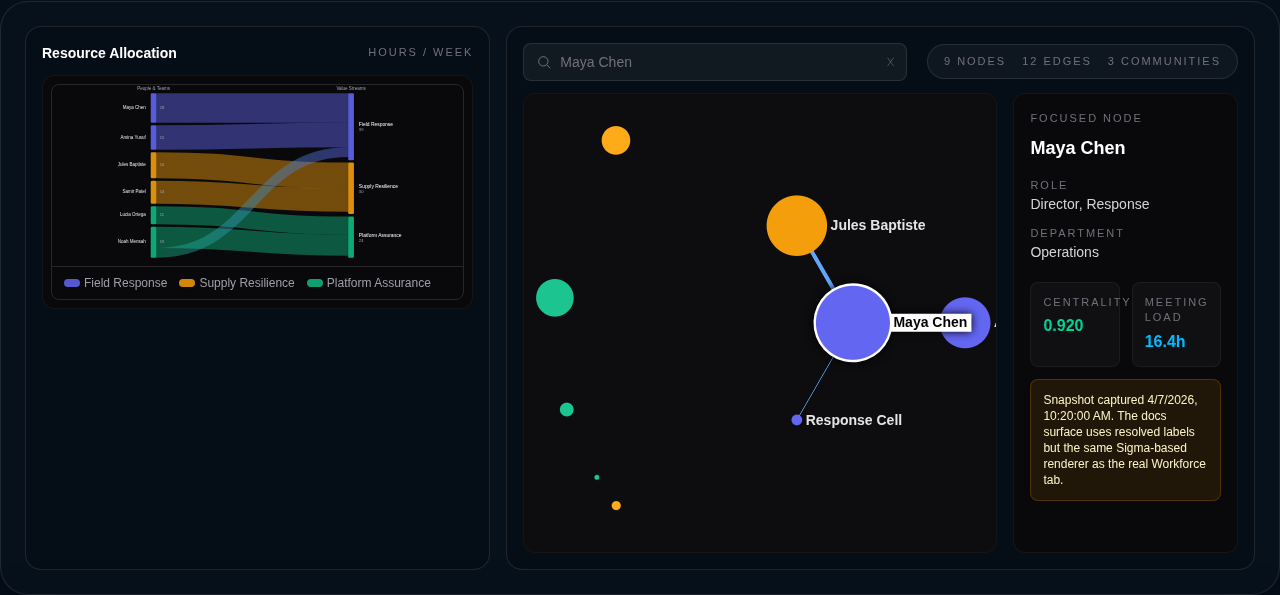
The resource allocation Sankey at the top of the tab and the org graph canvas beneath it.
What the Workforce tab shows
The Workforce tab lives at the top of every dashboard’s navigation and has two sections. At the top, a Sankey diagram shows resource allocation — where time and headcount actually flow, derived from the org graph by default and enriched with HR or finance data when you connect it. Below that sits the org graph itself: an interactive canvas rendering people, teams, and departments as nodes, with formal reporting lines and real communication edges drawn between them.
You can focus on any individual and the view reorganizes around them, surfacing their direct connections with edge weights, their centrality score, and their weekly meeting load. A fuzzy picker lets you jump to anyone by name, role, or department. A timeline scrubber at the top of the graph lets you walk backwards through historical snapshots — hourly for the last 30 days, daily for a year, monthly forever — so you can see how the network shifts after a reorg, an acquisition, or a quarter of burnout.
Where the data comes from
Formal hierarchy comes from Google Admin Directory or Workday. Communication signal comes from Google Calendar (meeting attendance and duration), Gmail metadata (sender/recipient pairs and volume — never message bodies), and Slack (DMs, @-mentions, thread replies, reactions, and channel co-membership). Connect the relevant sources on the Integrations page and Delphi will start building the graph.
When a Workday connector is set up on a Workforce dashboard, the org graph is automatically bootstrapped from worker data. Formal hierarchy edges (manager to report) are built from Workday’s organizational relationships, and resource allocations are derived based on meeting-load estimates. This provides immediate value on the Workforce tab — the Sankey diagram and org graph render from day one without requiring communication data. Calendar, Gmail, and Slack can be added later for richer signal.
You do not need all sources to get value. A Workday-only graph gives you formal hierarchy and resource allocation. A Slack-only graph is useful. A Calendar-only graph is useful. The more sources you connect, the more of the picture you see.
Privacy model
People are the most sensitive data in any business, so the org graph treats identity as a hard boundary. Every node is identified by an opaque, per-tenant token — a one-way transformation of the underlying email, scoped to your tenant so the same person carries different tokens on different tenants. Raw emails are never persisted in graph data or snapshots; they live only in a separate, gated identity registry that Delphi redacts at read time based on the caller’s role.
What you see in the UI depends on your role. Viewers and analysts see only role and department on each node — the graph is anonymous but still analytically useful. Editors additionally see display names, so the picker and the detail panel show you who you are looking at. Admins and owners additionally see email addresses for resolution. The redaction happens server-side on every request; there is no client-side downgrade to bypass.
Every single read of the org graph emits an entry to the audit log, including the caller, the dashboard, the snapshot ID, and the resolved scope. HR-adjacent data leaves a trail by design.
What the analyses surface
Each snapshot is run through a set of graph analyses, surfaced on nodes and in the snapshot metrics:
- Centrality — a composite of degree, betweenness, and closeness that identifies who sits on the most information paths. Hub nodes are visually larger in the canvas.
- Communities — a clustering of who actually talks to whom, color-coded on the graph. Communities rarely match the formal departments, and the mismatches are often the story.
- Alignment — a score that quantifies how closely the communication communities align with the formal reporting tree. A low score means the org chart has stopped describing how work happens.
- Bottlenecks — people with high betweenness but low formal authority. These are the people quietly holding the org together, and they are usually the people closest to burning out.
- Meeting load — normalized hours per week per person from calendar data, so you can see where meeting debt is accumulating before it becomes a retention problem.
Who can see it
The org graph is classified confidential and gated to analyst scope or higher. Viewers and auditors are blocked entirely — HR-adjacent personal data is distinct from financial or compliance data, so Delphi does not grant blanket auditor access. See the roles guide for the full scope hierarchy.
If the Workforce tab is empty on a dashboard where it should not be, the two usual causes are: no communication sources connected yet (head to Integrations), or the snapshot has not been captured yet. Ask Delphi in chat to “analyze the org graph” and the result will be persisted to the tab.