Every KPI in Delphi knows where it came from. It isn’t just a number on a card — it’s a first-class object with its own history, its own formula, and its own chain of custody back to the raw data. When a number moves, you should be able to ask why and get a straight answer. KPIs in Delphi are built so you can.
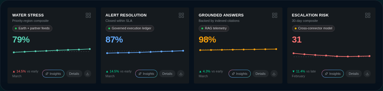
An example command center showing the same KPI and visualization language used throughout the product.
Define a KPI
A KPI starts with the obvious pieces: a name, a short description, a unit, and whether up or down is the good direction. You then point it at one or more data sources — a dataset field, a connector feed, or a sampled value — and pick how to derive the hero number: latest, sum, average, count, min, or max. You can also pin a target so the sparkline renders a dashed reference line, and a comparison period so the card shows a delta against last week, last quarter, or last year.
Most users don’t hand-author any of this. Ask Delphi in chat to create a KPI and it will wire up the sources, formula, and comparison for you based on the datasets already connected to the command center. See Connecting data for how those datasets get there in the first place.
Lineage and provenance
Every KPI carries a lineage graph — a small DAG that walks from raw sources, through any transforms, to the output value shown on the card. Click the Details button on a KPI and Delphi opens the lineage modal, which shows sources, transforms, and output as three stacked rows so you can trace the number end-to-end in one glance.
This is part of the Universal Provenance system that tracks lineage across all artifact types. Every KPI gets lineage tracking automatically — if the agent doesn’t provide explicit lineage when creating or updating a KPI, Delphi auto-generates a minimal graph from the KPI’s source. A small provenance indicator on each KPI card shows the state at a glance: green means a full chain (source, transformation, and artifact all present), yellow means source-only (no transformation record), and red means no lineage at all. Lineage completeness feeds directly into the Trust Score on the Compliance Dashboard.
This is not a nice-to-have. When a regulator, a board member, or a skeptical colleague asks “where did that figure come from,” the lineage graph is the answer. It’s also what makes KPIs safe to use in reports and briefings: the number and its derivation travel together.
Reading the lineage modal
Each node in the graph expands into a type-specific panel that shows what’s actually at the other end of the reference. Source nodes resolve the connector, sample, or dataset they read from and render its name, freshness, and key metadata inline; transformation nodes show the operation and parameters; artifact nodes link back to the KPI or visualization they produced. If a node has more detail than fits, a raw view reveals the full record with sensitive fields like API keys and access tokens redacted.
Visualizations reuse the same modal and the same node bodies, so the reading experience is identical whether you’re tracing a hero KPI or the chart sitting next to it.
Inherited classification, origin, and credibility
A KPI doesn’t just inherit lineage from its sources — it inherits the sensitivity, origin, and credibility of those sources, propagated automatically. The rule is fail-closed on sensitivity and worst-of on credibility:
- Sensitivity is the maximum across sources. A KPI built on a
publicdataset and aconfidentialdataset is itself treated asconfidential. A missing classification on any source counts asrestricted. - Credibility is the minimum across sources, with the full source classification of the weakest source carried along so the credibility meter can render directly. A KPI that mixes a
.govsource and a personal blog scores at the personal blog. - Origin is the least-trustworthy origin across sources. If any underlying dataset is
synthetic, the KPI is treated as synthetic and its credibility is capped at 0.1. If any source ismodeled, the cap is 0.4.
These values update automatically whenever a dataset, KPI, or visualization changes — there’s nothing to recompute by hand.
The propagated state surfaces in two places on the KPI card:
- The inherited classification badge in the card header — a sensitivity tier pill (
PUBLIC/INTERNAL/CONFIDENTIAL/RESTRICTED) plus a four-bar credibility meter, hover-able for the precise score. - The SAMPLE label and gaussian-blur overlay for synthetic-backed KPIs — the same affordance the underlying datasets carry, so there is no way to look at a KPI built on synthetic data and mistake it for a real number.
The agent reads these inherited values before answering any question about a KPI’s movement. A “why did X jump?” question about a low-credibility or synthetic KPI gets an answer that’s explicit about the underlying trust posture, not a confident-sounding analysis on top of weak data.
Versioning
KPIs are versioned automatically. The first time you save a KPI it becomes version 1. When you materially change the formula, the sources, or the description, Delphi bumps the version and appends an entry to the computation audit trail with the actor, the timestamp, and what changed.
This means a KPI’s history is a real, inspectable timeline — not a guess. If “recidivism” meant one thing in Q1 and a slightly different thing in Q3, you can see exactly when and why the definition shifted, and who made the call.
Reading the provenance badge
Under the title of every KPI card, you’ll see a small pill: the provenance badge. It shows the source the KPI is reading from and a colored dot indicating freshness. Green means realtime or near-realtime — the number you’re looking at reflects the latest data that’s landed. Yellow means historic, a value derived from a frozen window. Gray means sampled, a representative slice rather than a live feed.
Hover the badge to see when the KPI was last updated, and click it to jump straight into the lineage modal. The badge is the fastest sanity check on any dashboard: if it’s grey when you expected green, you know to investigate before trusting the number in a decision.
Asking Delphi about KPI movement
The most powerful thing you can do with a KPI is ask Delphi why it moved. In chat, try “why did recidivism jump last week?” or “what’s driving the change in average handling time?” Delphi reads the KPI’s lineage, pulls the relevant underlying data, and gives you a grounded explanation instead of a guess.
Because the lineage, versioning, and provenance are all first-class, the agent has real answers to work with — not just the hero number on the card.